Charities truly live or die by the user experience. Give Your Donors an Amazing Experience
I recently spoke with a non-profit organization in North Carolina that needed an increase in charitable donations. During an assessment of their current site, I noticed that their online giving process needed some simplification and testing. Your goal should be to simplify the process of making an online donation. This article will briefly guide you to some of the major things to look for. Getting people to open their wallets online is a very difficult thing to do, so I hope some of what you learn here can be used with your clients.
Donation Button
Ensure that the donate button is clear and distinct from the background and other elements on the page. User’s number one complaint is not knowing how to donate. Make this the easiest element to find on the page. Another important thing to remember is to change button text so they say what they do, instead of having a button labeled “submit”. This will help users navigate your site more efficiently.
Content has the Lead Role
This article won’t be covering content, but it is important to point out that content is the number one factor in increasing your conversions. Users love seeing uncluttered content that is easily scannable and consistent. Use language and offer content that is crafted specifically for the audience. Ask yourself if visitors can connect with the organization on any page of the site? If so, you are on your way to improved results.
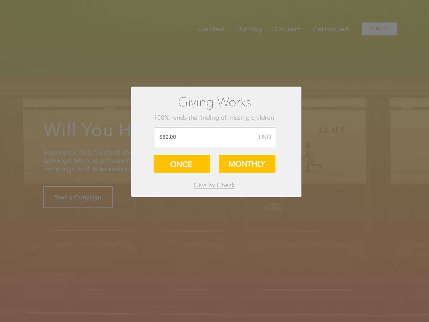
Distinguish between one-time and monthly donations
There are two basic forms of donations that most charitable organizations accept: recurring payments and single donations. Make sure you allow users to select one or the other from the beginning of the process. Also, if the organization accepts any other forms of payment, include them as a third option as shown in the example below.
I designed a mockup of recurring payments and a single donation button. This is the first step after a user clicks on the donate button.
A/B Testing
One of the most important things you will need to do to see increased donation conversions is through A/B Testing. Ensure that you are regularly benchmarking and testing the design, imagery, copy, usability and page speed. Some changes work well with certain audiences, but not others, so know your users and their behaviors.
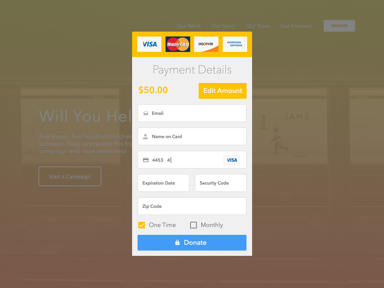
Donation Form Best Practices
1. Put the easier field groups first to lower the engagement barrier
2. Make the form look short and easy to complete
3. Remove any unnecessary form fields
4. Eliminate body copy
5. Allow the ability to change details like donation amount
6. Indicate that the user’s information is secure (Note: I’m simply using a lock icon in the example below)
Example mockup of the payment details form
Lastly, get creative and try out new things. For example, you could create a ‘donate via text messaging’ option for your mobile users. Again, test it out with tools like Optimizely and Google Analytics, then monitor the results.
For further reading, I recommend a book on persuasive design patterns called Evil By Design by Chris Nodder. It is an excellent read on how to leverage human habits in our designs.