Annual Payments
Annual plans are great for both customers and the business. It means they can get a substantial discount, only have to worry about paying every twelve months or so, and the process of paying for the plan is easy.
Where it gets confusing and manual right now is how we calculate and display the plan in the UI over the course of the year, and renewing the plan when it expires. This is made more confusing by the fact that it is based on the pre-paid credits, not a calendar year. So if a customer changes their number of users over the course of the year, the renewal period will actually be shorter (in most cases) or longer (in a smaller amount of cases) than 12 months from the original payment date.
Client
Help ScoutDate
2018Role
UI/UX, Web DevelopmentGoals
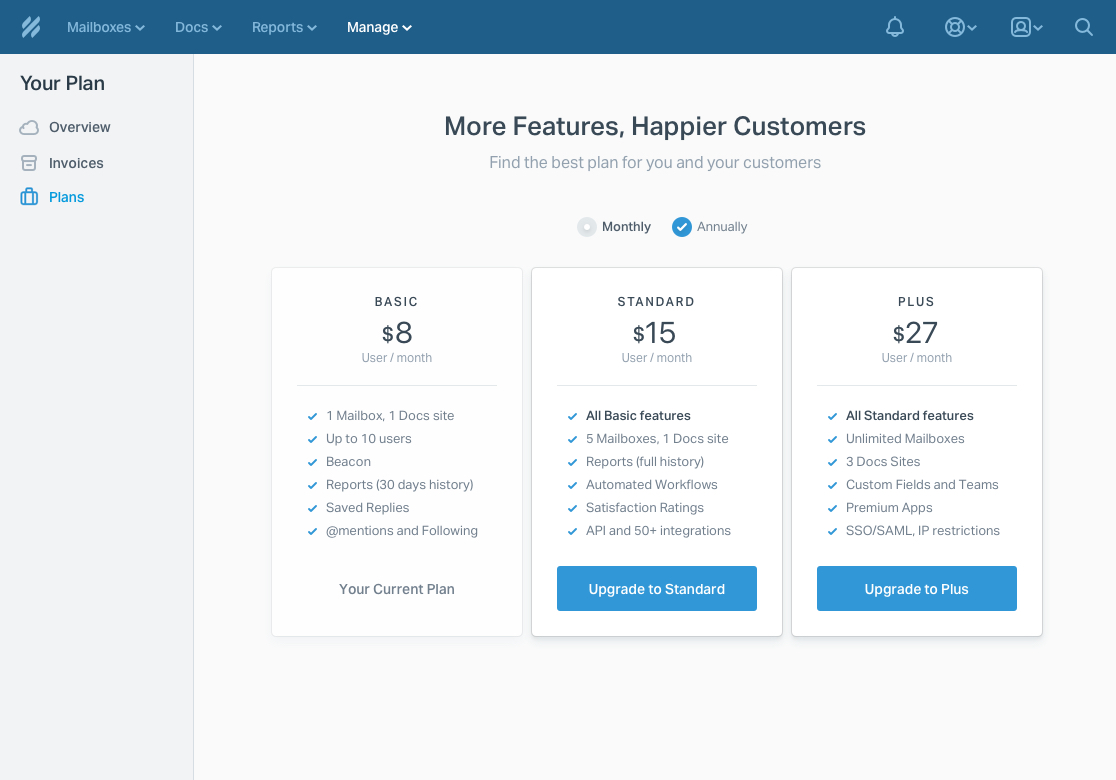
With this project we aim to accomplish 3 things:
- Simplify the design of our plans page.
- Make it easier for annual customers to understand what price they are paying and when their pre-paid credits will expire. In line with this, we want to make it easier to support these customers in Sumo.
- Enable auto-renewal for annual plans – meaning we will store a customer’s CC details and automatically bill them whenever their pre-paid credit runs out – and elevate this to the preferred payment method.
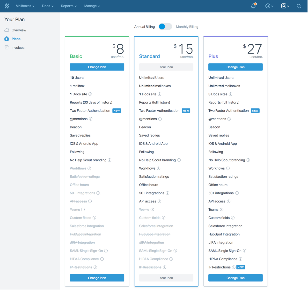
Clean Up
The current plans page contained a very large amount of plan and feature information. Our users want to upgrade/downgrade their plans and see features at a glance. The goal here was to show only the most helpful plan information.
Design Process (Overview Page)
The old way
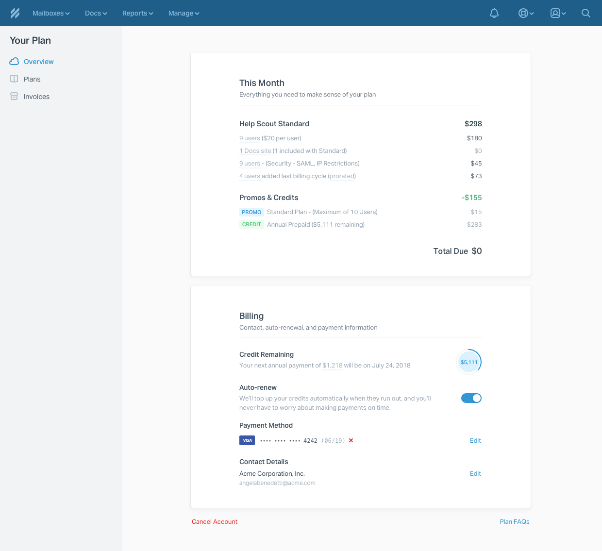
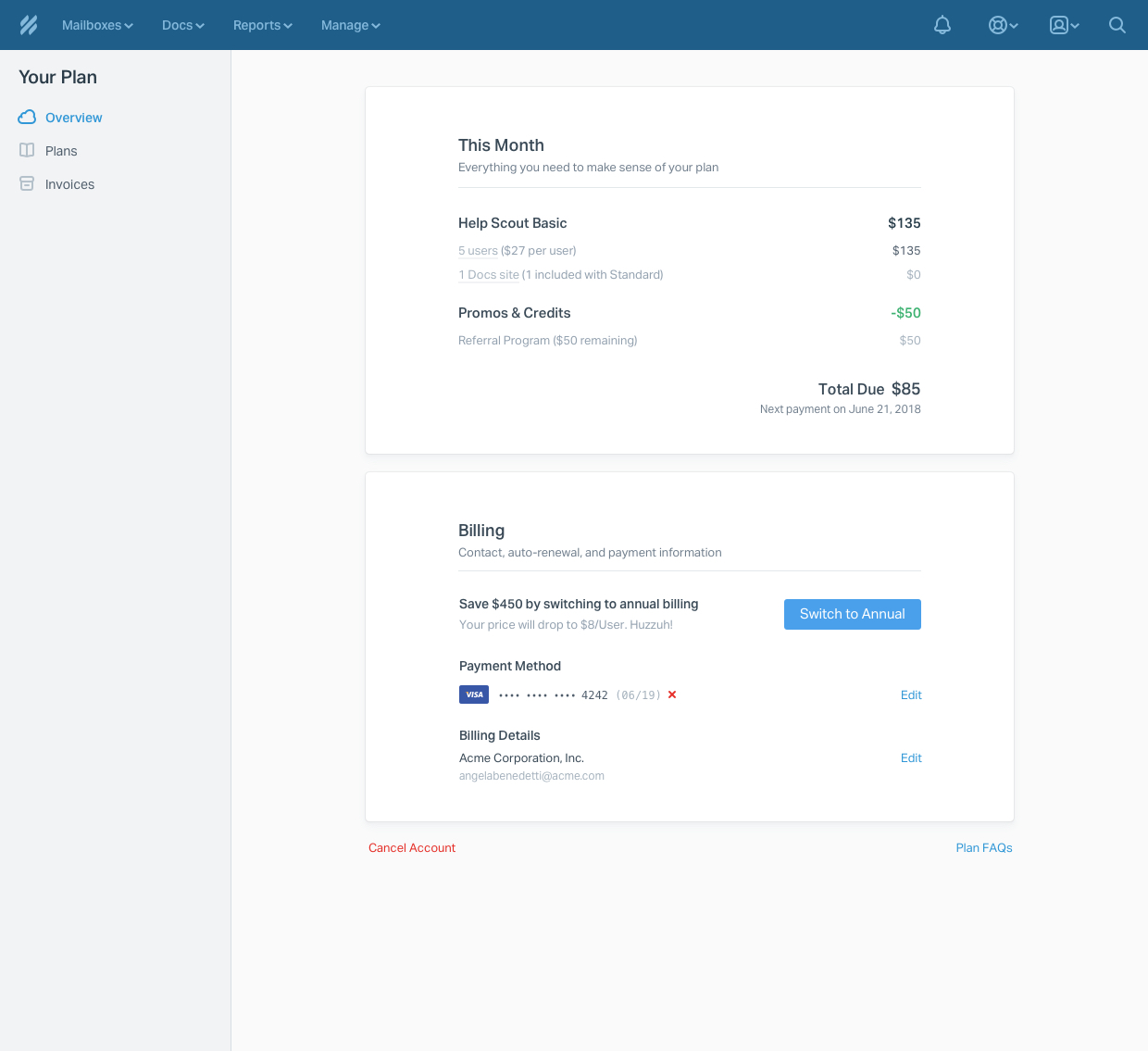
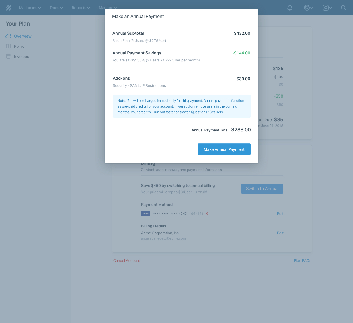
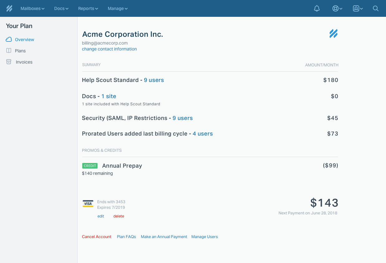
When someone pays $288 for 3 users on the Basic plan, they actually get $432 of credit that shows up on the plan Overview page. And it says they are being charged full price (not the annual discounted price). This leads to a lot of confusion.
The new way
When a user is on the annual Basic plan, they’ll pay $8/User and they’ll see that price in the UI, and on their invoices. When they’re on monthly, they’ll pay/see $12/User. Promos/credits, additional Docs sites, and add-ons should all continue to show up as separate line items.
Visual Solutions
The Plan Overview page needed to have 2 main areas – “This Month” and “Billing”. “This Month” is information from the Summary and Promos sections as well as the total to pay. “Billing” gives billing details (previously above the Summary section), info about the card, and new details about annual billing. I started out by creating simple wireframes of the new content for the page. then I noted observed visual design issues with the current design and major areas for improvement.
Requirements
- Users need to be able to visually see remaining credits and when their prepaid credits will run out.
- Promos and Credits (line items) should be visually distinct from each other.
- If a user is currently paying monthly, they should see a promotion of the page to pay annually ( discounted price)
- The billing section needs to be more structured and cleaned up.
- There was also a lot of visual weight in the links, font sizes, and colors which made the overall section seem confusing at a glance. So I toned down a lot a lot of elements to make them clearer overall