Team and Role
Design Process
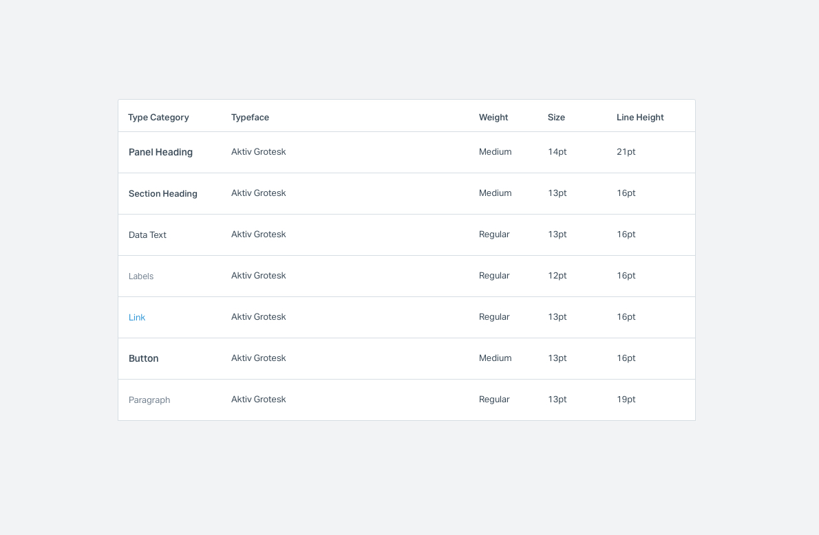
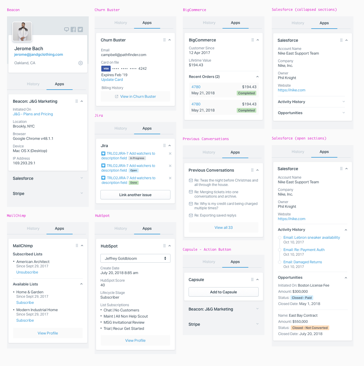
Defining Components
I then took all of my research and started defining components and their use cases.
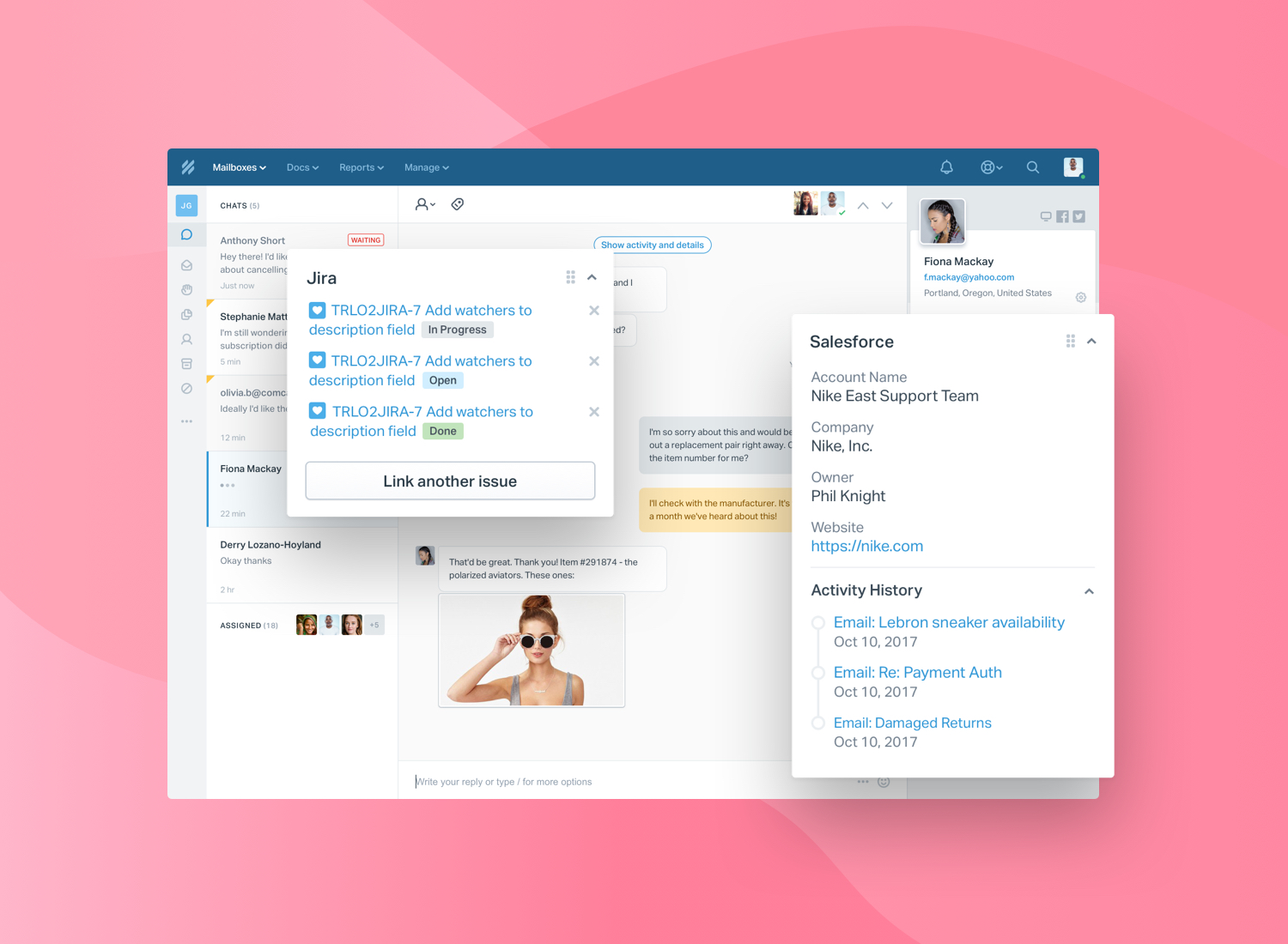
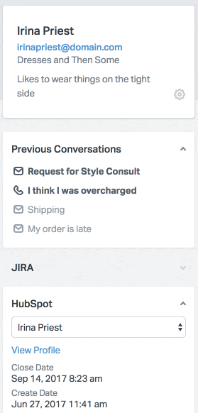
Sections: Apps can optionally have one or more sections of content. Each section should include a heading and content. If you add a toggle class, the section can be expanded and collapsed (like apps themselves). Help Scout should leverage local storage to remember what Apps/Sections each user has toggled.
Footers: A footer typically has one or more action links. The footer includes buttons and/or links.
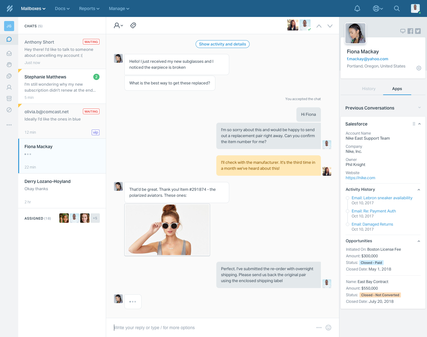
Key value pairs: The original design had a horizontal layout of labels and descriptions. The goal is to use vertical key/value pairs when possible.
Timeline: This component includes event name and event meta (timestamp or other less important bits of information attached to the event).
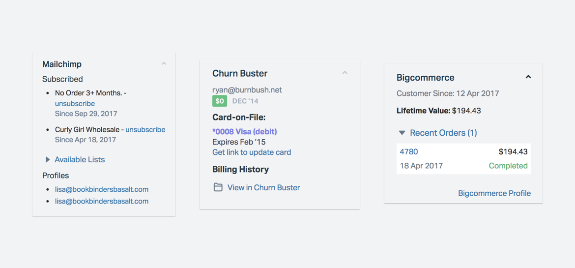
List (with bullets): This can be used in a bunch of different ways. The most common is to display the mailing lists the customer is subscribed to.
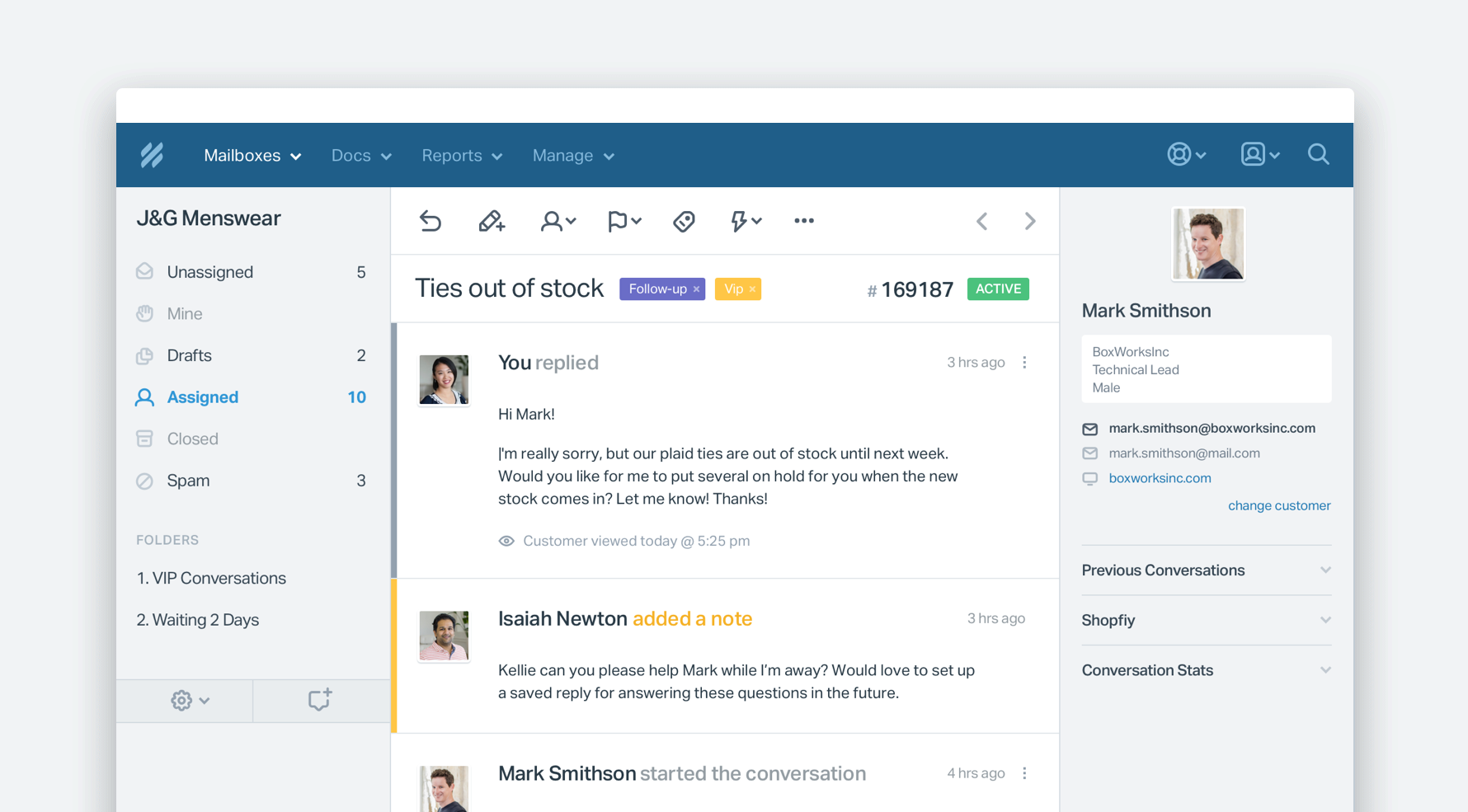
Block List (no bullets): This is used for items with a bit more data — usually 2-3 lines worth of data. Open Activities in Salesforce are a good example.
Orders: This component is used in our eCommerce integrations. There’s a lot of data to display in a small space, so it’s pretty challenging. Data we try to include in each order by default include the following: Order name/number, amount, date, and status.
Prototypes
Outcomes
What People Are Saying
“The sidebar is now easier on the eyes and customizable to boot!”
@itsdavemartin @helpscout diggin' the new conversation sidebar design. Good stuff! 🙌
— Tyler Wanlass (@twanlass) January 9, 2018
Shoutout to @helpscout for the sidebar redesign stuff happening lately. Easier to read, cleaner… nice!
— Jordan Smith (@Malfhok) December 21, 2017